I stumbled upon the Character Design Challenge community about nearly several months back whilst surfing through Tumblr. And for the time being, all I really saw it as was reference and inspiration for my own works in other modules, before finally realising that it would actually be an enjoyable challenge to participate in as well. Looking through the site's basic guide, it was incredibly simple to join this group (All you need to do is simply join it's Facebook group, where you will also be submitting your work there during each challenge). Aside from getting to enjoy the works of others and finding new artists, the very same could be said if you should so decide to participate. You will not only be able to build up your portfolio from this challenge, but will also have the opportunity to share your work with others from around the world. And so there are most definitely other perks aside from winning when joining in on this challenge, though winning would also be a plus considering the fact that a Special Guest judge is invited every month to look over everyone's works.
I initially thought of skipping last month's theme (That being "The Legend of Zelda", seeing as it would require for us to work on something more related to fanart than original, and to add to that, I really was not particularly familiar with the series), I eventually decided to participate to better familiarise myself on how to submit my work and perhaps how to better improve when it came to my next submission for the theme that would be announced the next month after. Also, I always was a sucker when it came to fanart (More so a curse, than a blessing, especially when I REALLY need to get more original works done).
Choosing a character was simple, I absolutely adored Princess Zelda's design in Hyrule Warriors (As did many of my cosplay friends), and so decided to do some sort of illustration based on that outfit. The rules were pretty simple from what I could see, and they were:
- Stick to the theme of the month
- No environments or overly detailed backgrounds
- Design a full figure (Not just a head or a torso)
- One single character (Additional characters and creatures like pets are acceptable)
- Only one design for each challenge
And while there are more rules when it came to this challenge, these were certainly the main five to abide by should you wish to have your work accepted into the challenge. I was certainly relieved to know that this challenge was kept as fun and stress-free as possible for all of us. And so, after rereading the rules at least one or two more times, I decided that it was time to get on with my first ever submission into this challenge before it was too late.
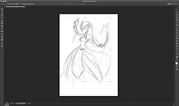


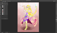
For this submission, I was aiming to create something a little more stylistic than my usual works, and so played around with several brushes and made heavy use of geometric shapes whenever possible, while of course basing it on the original design itself. This probably took a lot longer than it should have (About 1 and a half days worth?), and so I hope I can learn from this experience to create next month's character design with more efficiency. A lot of design elements were simplified (Such as her shoulder pads) heavily from the original design with very basic if not textured shading used (Based on some of the stylistic artworks that I absolutely adore from some Disney concept artists). After believing that my work was ready for submission, I then included my link (I wouldn't really consider it a watermark) at the bottom, so that others would be able to find my site. While there is a chance that the group could still share my design on Tumblr, they don't necessarily link each work to their respective artist, and so this was a pretty important little element.
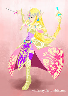

By the time I decided to submit in my first 'character design', I realised that my monitor tablet was not as closely colour calibrated to my laptop as I thought it to be. And so in the midst of my submission, the colours were incredibly off (Too light if not horrifically saturated) from what I had seen whilst I had been working on it. After trying my absolute best to tweak it the best I could, I simply told myself then that I would learn from my mistakes and simply submitted it into the Facebook group after... it took me an entire day before I was able to calibrate that thing the best I could, but at I won't have to keep switching between screens to check and see if the colours are decent enough now.
I wasn't too surprised to see that I didn't get as many likes as compared to the other submissions (And yup, I shared it on my page), though I did get more notes when submitting it on Tumblr than I did on the Facebook group. While the winner would not be judged based on the number of likes they received, I still knew that I wouldn't have any chance of winning, it was still a good trial and error sort of thing for when the next theme came along, either way. And, speaking of that...
This month's new theme is Heavy Metal, so expect updates soon on that submission!


