I haven't made all that many changes to my portfolio this year, aside from adding in some new works from both my Context of Practice 3 and Extended Practice projects. And while I had wanted to put in my new character designs as well, I feel that it wasn't enough to fill out an entire page spread (I only really have two at this point in time), and so decided it might be wise to do a few more before putting them all in there. Seeing that it practically has the same layout, I decided to simply update my old portfolio publication on ISSUU instead of simply publishing a brand new one. Another exciting fact is that I might print one or two physical copies to bring to studio visits after this deadline.
Wednesday 18 May 2016
Business Card 2016
I wanted to make a huge update to my business card design, seeing as I have been using the same one for nearly several years now. And after collecting some incredibly gorgeous business cards that also had a nice clean layout to them back at Thought Bubble, I used them as my main inspiration whilst putting together this new design. My Twitter, Tumblr and Instagram are now included on this one, with the Wix site removed seeing as it is heavily outdated as compared to my other portfolio sites. And I have to honestly say that this is actually the first time that I properly used one of my works as a way to decorate my card (Unlike that texture overlay I made for a content page all those years back... yup, that wasn't even a real illustration, to be perfectly honest).


Tuesday 17 May 2016
Showreel 2016

Seeing that we will be presenting our showreels in class tomorrow, hopefully I will get some helpful feedback on what should be removed and what parts should be rearranged.
Cannon Busters
The first issue was due to be published by Com.x in 2003, but was moved to Devil's Due in 2004. And while the series was very well received by both critics and fans alike, Thomas' incredibly hectic work schedule resulted in him making the decision to have the series reprinted and to have it continued as an OGN. And so, the graphic novel was due to be out in the winter of 2009... can't say there's any other news about it other than this, unfortunately.
While the pilot was expected to be released at the end of January this year, due to minor production delays (That was announced through their Kickstarter page), the release date ended up being pushed back just a little, and while it's already May... it is unknown when exactly this will actually be released in the end. It was also stated however that at the risk of creating another fake promise, they have decided to simply keep their heads down and push towards the finishing this properly for everyone's enjoyment. And heck, for the sake of a quality piece of work, us loyal backers will most definitely be willing to wait for everything to be properly straightened out. Nothing good ever comes out of rushing out a project (And I have especially seen that so many times when it came to video games...).

I am not necessarily the biggest expert on Kickstarter, and in fact, I think Cannon Busters was one of very few projects that I backed (The other one was this science fiction graphic novel years back) simply because of how big a fan I already was of LeSean Thomas and how I just knew that this was most certainly going to turn out amazingly. Reading through their progress posts on Kickstarter, I found it incredibly enlightening just getting to know the behind the scenes process when working on such an animation.


Monday 16 May 2016
A Little Portfolio Expansion
While it won't be possible to have this work finished before this module's deadline, I would still however like to talk about how it was that this had all even started.
Through roleplaying online (A hobby that allows me to further improve on not just my writing, but also my storytelling, scriptwriting and even character development), I have met and befriended an incredibly talented writer with some of the most inspiringly developed original characters I have seen in years. Having a diploma in Communication and Information Design, my friend is also considering a course in Game Design in the near future, as her ex-facilitators encouraged her to do so after learning of her interest in creating stories and characters.
While roleplaying would be considered a casual hobby by many, I do also believe that people can also take advantage of it and use it for more professional means if they truly have a deep passion for writing and creating their own characters, such as my friend.
It was in due time where I felt that I just had to do an illustration of some of her characters to show my appreciation for them myself. But, while I initially planned to have this done as a simple gift for her, I began thinking that it would actually be a worthwhile addition to my portfolio. I felt that this could be a very special art piece that is akin to Sam Spratt's artworks (I am no longer a huge fan of his works due to how repetitive they have become, but I can still appreciate the amount of detail that he puts into each commissioned piece that he does for celebrities). Unfortunately, I had to spoil the surprise and tell her of my plans as it was only right to ask her permission on this. And aside from saying yes, she was more than happy to help me in any way she can and share with me an extra details I could possibly need whilst painting them.
And with all of these characters already being give face claims by her (Such as actress Maggie Q), it will certainly be fun getting the chance to tweak their appearances to make them appear more like how she had envisioned them.
Big Fish and the Begonia

Big Fish and the Begonia is an upcoming Chinese animated film directed by Liang Xuan and Zhang Chun. It is notable for Studio Mir's (Known for their involvement in the Legend of Korra, Season 4 of The Boondocks, and the upcoming Voltron: Legendary Defender) attachment to it (It's pretty obvious when looking at the style of the animation itself). The directors have been developing this ambitious animated fairy tale over a decade via crowdfunding and their self-owned studio, B&T. The expected release in China will be on July 8th 2016, but as of now, it would see that there isn't any official news of when it will be released outside of the country.
The synopsis goes as such:
It is a world within our world, yet unseen by any human, and the beings here control time and tide and the changing of the seasons. On the day Chun turns sixteen, she is transformed into a dolphin to explore the human world. She is rescued from a vortex by a human boy at the cost of his own life. Chun is so moved by the boy's kindness and courage that she decides to give him life again. But to do this, she must protect the boy's soul, a tiny fish, and nurture it to grow. Through adventure and sacrifice, love grows, yet now she must release him back to the sea, back to life in the human world.

Chinese animation has certainly come a long way, especially with other animation fans calling this very film "the dawn of the Chinese animation industry", and even voting it as "the most anticipated animated film". And as one who was a fan of older Chinese animations... that were never necessarily masterpieces when compared to all the other animations out there (I'm looking at you, A Chinese Ghost Story, though, then again, this will also be hand-drawn/CG hybrid as well), it does my heart good to see how they going in so many directions when it comes to their animations. Aside from this film, there have been other recent Chinese animations that have been very well received, such as Monkey King: Hero is Back (Another animation by the same film company), and Little Door Gods. Though, being a bigger fan of 2D animation myself, I certainly can't help but be part of that excited group of animation fans who are really looking forward to this gorgeous film once it is released.
There really isn't anything else I can actually say (Seeing that this film hasn't even been released yet), but once again, with films such as this, I will definitely be keeping a closer eye on the Chinese animation industry (I must shamefully confess that neither the Chinese nor Korean animation industries have truly interested me at the start of this course until I had actually looked properly into them) for years to come, especially if this is how they are going to progress. It is of course also interesting to note that this is yet another film that had only been made possible with thanks to crowd funding.
“Most Chinese animators have struggled for years,” said Enlight chairman Wang Chang-tian. “I believe the improvement in the quality of domestic flicks will give us a Chinese answer to Pixar.”
Other animated films that will be produced under Enlight’s Coloroom Pictures label are:
Other animated films that will be produced under Enlight’s Coloroom Pictures label are:
- The Legend of the Jade Sword
- Charlie IX & DoDoMo
- Dragon Nest, based on a game
- Fantasy of Journey to the West, based on a game
Unravel

Unravel is a puzzle platform video game developed by Coldwood Interactive and published by Electronic Arts. It was announced on 15 June 2015 and released in February 2016 for PlayStation 4, Xbox One, and Microsoft Windows. The game centres on Yarny, a small anthropomorphic creature made of yarn whom the player navigates through the environment, utilising the unraveling yarn which makes up Yarny to solve puzzles, avoid dangerous creatures, and traverse obstacles.
Although developer Coldwood's previous works received unfavourable critical reception, Unravel reportedly showed enough promise for EA's DICE to arrange a publishing deal with EA. Many would have remembered the game's developer and creative director, Martin Sahlin, presenting the game back at EA's E3 2015 conference. What however made it all so memorable was the dear man's incredibly nervous but still excited presentation, having "reacted on-stage appearance like most of us would: with shaking hands and a warbling voice." This presentation was met with a positive reception from the conference's audience, and from outside audiences as well. Following the announcement, Sahlin himself became the focus of well-circulated appreciative posts and fan art on social media website such as Twitter and Tumblr.
If you haven't seen it for yourself just yet, be prepared to "Awww..." your heart out (Though, I wish I was more coherent in my presentations as he was):
If you haven't seen it for yourself just yet, be prepared to "Awww..." your heart out (Though, I wish I was more coherent in my presentations as he was):

The game itself, especially its aesthetic, was also well received after its announcement. I mean these gifs don't even do its beauty justice. The game did however also drew comparisons to Limbo (Most possibly due to the fact that they are both puzzle platform video games, but other than that, they are both pretty different if you truly had the chance to properly play the both of them for yourself) and Sony's LittleBigPlanet . The game's backgrounds and puzzles are inspired by the landscape of Umeå, Sweden; Sahlin drew inspiration for the game after creating a Yarny doll out of tire wire and yarn during a family camping trip in northern Sweden (Which was also mentioned in the video above). Sahlin has elaborated, "We live in the sticks. It's a very small town, very far north, close to the Arctic circle. There's not a lot of people, but a whole lot of countryside. I wanted to share some of that, some of the places that I love. I think you don't really see enough of that in video games. You tend to see more fantastical stuff."
And in addition to its design, the game runs on Sony's PhyreEngine, which has been adopted by several game studios and has been used in over 90 published titles (Such as Disgaea 4: A promise Unforgotten, Amy and all of thatgamecompany's games)
... And what do I have to say about all of this? Needless to say, I found incredibly huge appeal in this game's aesthetic and thought it to be one of the most breathtaking games that I have seen in a long, long time. Remembering back to my COP3 dissertation and my look into acting in animation in video games, I really felt that Unravel was able to make you emphasise with its adorable silent protagonist. He has a really simply backstory when it comes down to it, but its adorable design and incredibly endearing animation almost immediately makes you want it to remain safe throughout the game. Which isn't possible, seeing that its a puzzle platform and all, so one needs to ready themselves for when they accidentally kill the poor guy during certain challenging puzzles.
Like many others, the game had caught my interest when I had first seen Martin Sahlin's presentation. Not only memorable because of how nervously he had gone about talking about it, but also for the fact that so much love and passion had been put into the idea itself. As he mentioned what it was that had inspired this idea in the first place (That being family and happy memories), you just know that this would be a game that would be born out of pure love, and that it would have so, so much potential to be what it ought to be.
While I am never necessarily a part of the subjective arguments that have been held by gamers over indie video games (Heck, I haven't even had the chance to watch Indie Game the Movie just yet) and studios, seeing Coldwood Interactive finally receiving such a positive reception for this game after their past failures signifies something pretty important for all us designers. You really have to make sure that there's real love put into whatever you're working on to meet true success (Also I know that I used the word love about 5 times in the past two paragraphs, shush).
The Remaking of Danger Mouse

Danger Mouse is a British animated television series and a continuation of the 1981 series with the same name. The series revolves around titular character Danger Mouse, the "world's greatest secret agent", and his hamster sidekick Penfold, who protect the world from a variety of danger. With help from his boss Colonel K and the genius scientist Professor Squawkencluck, Danger Mouse is equipped to defeat his nemesis, Baron von Greenback. In 2013, Fremantle Media confirmed to Broadcast that a reboot of the series was being considered, and in June 2014 it was announced that a new series was being made for broadcast on CBBC in 2015. The reboot is produced by Boulder Media for Fremantle Media Kids. It is directed by Robert Cullen, with Brian Cosgrove, one of the original creators being a creative consultant. According to Eldon, the animation style is 'much the same as the original'. The series is animated in Toon Boom Harmony, as the animators thought that Flash was too limited.
While Danger Mouse was never necessarily a part of my own childhood, this remake reminded me a great deal of the revival of Hanna-Barbera's Secret Squirrel back in 1993, retitled Super Secret Secret Squirrel and placed as a back-up segment to 2 Stupid Dogs, at least when it came to their character redesigns. If it isn't obvious, their redesigns from the original are noticeably sharper looking
Considering how old the original series was, the challenge when reviving this show was to bring new life into it through its writing and designs. Seeing Danger Mouse as a comedy than a children's show, they saw it necessary to hire the right writers for the show. There is a minimum of 4 writers for each Danger Mouse episode, as compared to other UK shows that only really have one head writer to write all the jokes. They especially aspired to reach the same level in writing quality like The Simpsons during that show's golden age. And in the end, the key to it all is comedy, so putting it simply, write the show and take the swearing, drugs and sex out. American writers were brought in to make sure an episode was intelligible to audiences outside of the UK (Eg, if there had been a plot about a major tea shortage in one episode, it was pretty obvious that it would have been more of a british joke than an international one), throwing in US jokes while they were at it.
The designers kept the painted backgrounds from the original as well as the character designs. Its visual style overall was incredibly vibrant looking while also dynamic enough to suit the action packed nature of the show. From the very beginning, they knew exactly how they wanted the show to look, it was just putting it all down on paper. It was most definitely a challenge to effectively blend live action and animated elements together, but they succeeded.

And as mentioned earlier, old character designs were only tweaked ever so slightly so that they had a more dynamic overall shape to them. Danger Mouse's nose for example was more accentuated as compared to the original, being given much more structure and definite shape than ever before. But other than that, his design wasn't actually drastically changed from the original. The essence of the original characters were kept in this reboot, that was one of the most important details when their designs were updated. The other challenge was to actually make sure that the new characters actually fit into that universe, that both old and new audience wouldn't have truly noticed whether they were actually from the original series or not.

Their backgrounds contained mainly photographic elements (Having taken advantage of their incredibly high budget in that area, with it being 70%), looking real yet at the same time stylised. 2D elements were integrated into 3D (Such as reflections and shadows). Which brings up the fact about how incredibly under appreciated that the compositing department in animation studios actually are. Without them, many of these gorgeous backgrounds would have not been possible. There was however the challenge of preventing it from simply becoming a collage, and they really needed to make sure everything actually blended nicely.
The process for the evolution of each scene goes as follows:
- Storyboards
- Background art
- Adding depth to the background and props (Compositing department strikes again)
- Atmosphere
- The animation itself
- Lighting
- 3d elements (Such as vehicles)
- Shadows
- Extra effects (Such as car lights)
Sunday 15 May 2016
Character Design Challenge 3 - Mermaids and Mermen
As the post title has pretty much stated, this month's theme for the Character Design Challenge is Mermaids and Mermen. While I was initially planning to go back to another old character design of mine, I decided to instead do something similar yet a little different. I had originally designed a Chinese jellyfish fairy sometime ago and had wanted to do a revamp of that very much like I had done for the previous character design that I had done. But as it was yet another Asian-oriental related design, I felt that I would save it for another time and do something different.


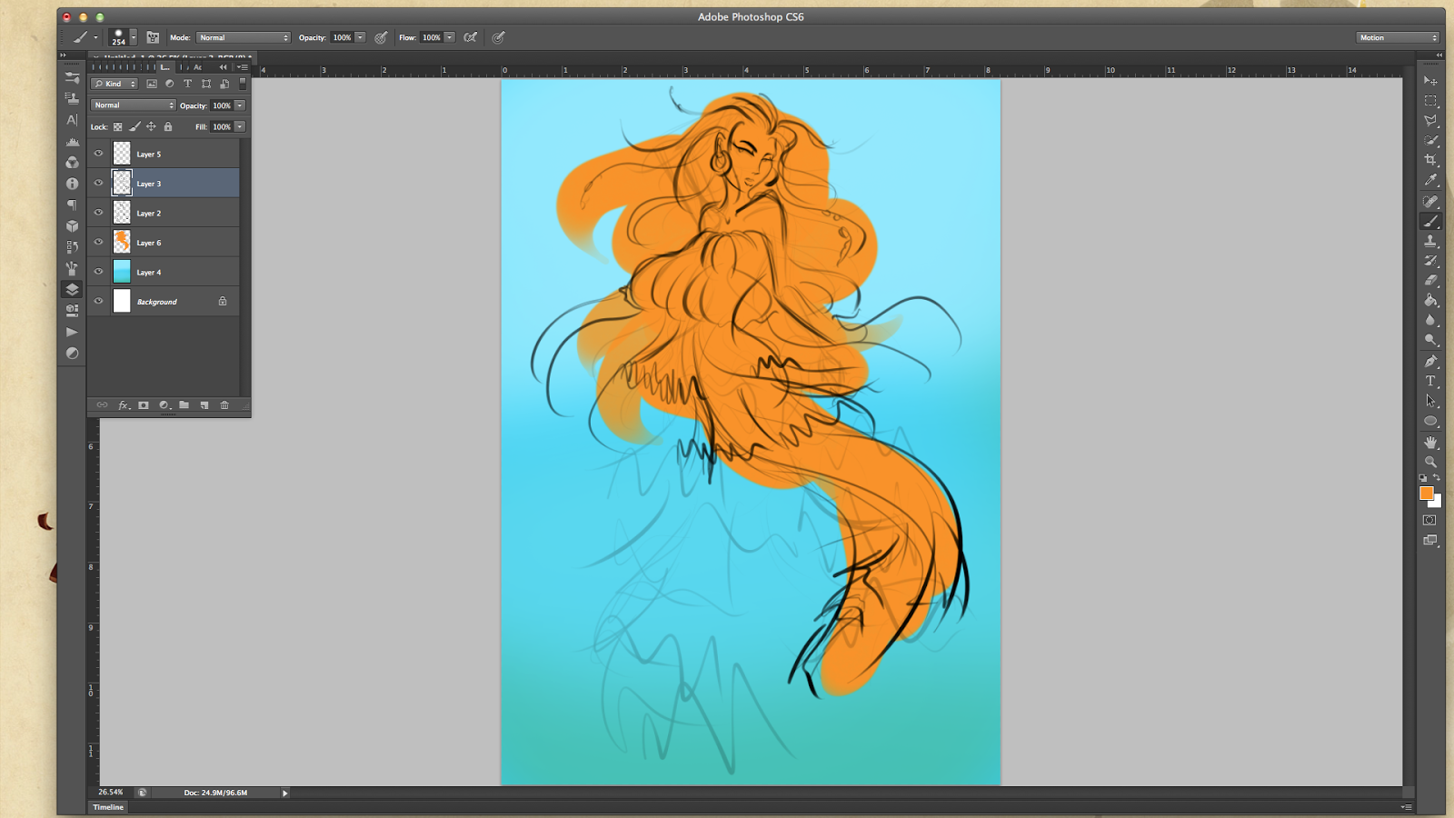

After seeing some really lovely examples online, I decided to use one of the many images available in NASA's Royalty-Free Image Resource and placed it over my sketch to aid me in the design's colour scheme as I went along. I did struggle with this design for quite a bit and erased and repainted several parts over and over. This was due to the fact that I was trying to avoid making it appear too busy as well as give it a decent silhouette shape (Which I still believe can be done much better).
I ended up placing that planet texture over the entire thing again as I eventually erased and painted over most of it while struggling with my character's shape (I even drew a fish-shaped outline over her for reference after awhile, namely 3 triangles). I also experimented with a lot more brushes this piece as compared to the previous one, there isn't much shading for this one in comparison, either, but thankfully the character still does not completely blend into the background itself.


And this is pretty much my very last character design for this module, but I hope to continue dishing out more original designs for months to come as this has been a really good if not enjoyable practice. This one is already getting more notes on Tumblr than my previous piece (Though neither of them are going to beat the Zelda piece, seeing that it is fanart, regardless of how God awful it actually is...) so I can only hope to garner more interests in my original works as I keep improving with each submission.
I might try to get a few Qwertee designs done before I round up this studio brief once and for all!
Friday 13 May 2016
Ernie Biscuit
Titular character Ernie Biscuit is a lonely French man who makes a daring leap in his later life to go to Venice, where he dreams of gondolas and perhaps love. However, as with many of Elliot’s unlucky characters, nothing quite goes to plan and Ernie ends up in Australia circa the 1960s. This beautiful and poignant addition to Adam’s filmography is sure to be screened across the globe and perhaps touch the hearts of all the lost souls out there trying to build the up the courage to make their own defining leap into the exciting unknown of the future.
I wouldn't have thought that Ernie Biscuit would be my sort of animation, and quite frankly, it probably still isn't. But from what I have heard, Adam Elliot normally produced more emotionally heart-wrenching animations when compared to this, and this was in fact his most light-hearted one to date. It wouldn't be surprising to know this considering the monochromatic look and rather warped character designs (With all their blemishes and other facial flaws, even the more attractive ones), and that is certainly what makes this animation all the more interesting. I would be lying if I said that I didn't get caught up in its story the longer it went on. I hadn't actually realised how long it lasted until the festival staff announced that there had been one more animation to show and that we had gone way past their planned schedule.
When compared to Mary and Max, it is notable that there is a much lower budget for this animation as compared to his previous works. I remembered there being numerous still shots with barely any movement (Save for some blinking and a subtle change in their expressions), with the narrator telling most of the story. And in fact, it is actually really effectively if not cleverly done. It could be said that the clear narration contributed to this, making the story easier to listen to and follow, but in all, this truly was an entertaining animation from Adam Elliot who has proven that some pretty amazing works can come out of a shoestring budget just so long a good story can still be told from it all.
Fresh Cut Grass
A sweet little dog visits the big city in search of his big sister. Having been close to his sister from a very young age, the little dog grows worried for her when he hasn't heard back from her in quite awhile. Also excited to see if she was finally living out her dream as a graceful ballet dancer, with a glittery congratulatory card in hand, the little dog readily sets off to find her. Considering the style used and how this film first starts, no one would have expected this animation to take... well, such a turn. But then, again, one needs to learn to expect the unexpected when attending these animation festivals... thankfully however, there was disturbing content for a reason and wasn't simply placed in for the sake of being disturbing. Granted, it has really striking visuals and a really vibrant colour palette (Which still makes the darker scenes oddly bright when they clearly aren't suppose to be). With how clean and fluid the animation and visual style appears at times, there are some times when the animation looks more 3D than 2D.The lighting is one of of the main highlights to me and is always beautifully done in each scene, be it the warm sunlight or the sleazy neon lights.
Written and directed by Robert Cullen and produced by Boulder Media, the studio is based in Dublin and has produced shows such as Foster's Home for Imaginary Friends, El Tiger, and The Amazing World of Gumball, and Season 2 of Wander Over Yonder. They are currently also producing the new series of Dangermouse. With so many favourites done by this studio, I am certainly going to keep a closer eye on them from here on out.
While I know that there's a much deeper meaning to this story, all I could really think about was how infuriatingly creepy these human characters are, the Furries, the Beastility lovers. It almost feels like this would be what Zootopia would have been like if humans had been featured alongside the animal characters. Everyone is probably going to wonder why exactly that only humans inhabit the big city, and while there are other animals, all of them appear to be forced into that little part of town and don't appear to be working in any other jobs aside from what we have seen in the animation. Could the same story not be told if it had been an all human cast? When you think about it, the moral is pretty much that while one clearly wants to live out their own dreams, reality kicks in and sometimes, all you are allowed to do is survive. Again, could the same story not be told if the little dog and his sister be humans instead? Most of this beastility stuff feels almost unnecessary, to be honest. And while it made things more visually interesting, I still feel that animal characters don't contribute much to this story aside from the fact that there's clearly some sort of prejudice going on here... which again can be shown through human characters.
My Home
My Home (Or Chez Moi, seeing as there are already so many animations that simply go by such a title), tells the story of Hugo as he struggles to come to terms with his mother returning home with a new lover, that being a massive anthropomorphic crow. A French animation directed by Vietnamese Phuong Mai Hguyen (As well as her first ever professional cinematic debut), it was one of ten films nominated for an Oscar award.
Certainly one of the most gorgeously done 2D animations I have seen at the festival, it is certainly interesting to see why it was that Mai had chosen to given the stepfather a bird's head. Especially when she made a comparison between it and other animals such as tigers and panthers, I had wondered if the crow had symbolised so much more than that, especially during several somewhat puzzling scenes that take place, particularly during the boy's dream. Despite the attempts to incorporate heavy symbolism into this animation, it is pretty clear what the main message is behind its story. Though if a regular human was to be put in place of the crow man, the audience might have probably found the story to be a smidge less interesting... it depends, really. And there were certainly lots of advantages that could be taken by having a character such as this, as shown in several scenes as he flies and spreads his massive 'wings' around the boy's mother (Which was certainly one of the most breath taking shots seen in the animation itself).
But yes, back to the visual style itself, I have always adored the painted style (Films such as the Secret of Kells and Song of the Sea uses something very similar as well, with their avoidance of using black for their line works), especially when the animation (Along with the shading) is just done with such incredibly fluidity. Based on personal experience, it can be such a huge pain to keep the shading constant, making the colouring process just as tiring a task as everything else. In fact, I am still struggling with that aspect as I rush to finish for my Extended Practice animation for our coming school exhibition in June. And I am still learning how to do clean line work on my own animations, and so it's going to take ages before I can even reach this level of delicate line work.
The Same River Twice
I hadn't expected for this animation to hit this close to home... especially during the second half. It had a sweet and cute beginning, but it was definitely the dramatic turning point that especially caught my attention (If not made me weep far too many tears for my own liking... awkward much). Listening to my own mother tongue as the story is told in it certainly brought back lots of childhood memories, it was hard not to smile a little because of that. I could even sense the genuine emotion in the narrator's voice as she goes over each memory... especially during the day when her father had gotten into that car accident. Her voice, while it did not waver, had fallen just a little more quiet when compared to the previous chapters that she voiced over for. It was clear that she held a tight bond with her father, and how going back to these memories still deeply affected her to this day.
The visual style used greatly reminded me of the illustrations I would see in my old mandarin school textbooks (Which in a way could be another form of nostalgia), with its painted look that was done successfully through digital means. I found it incredibly funny however just how much her father resembled mine, in terms of his appearance and his attachment to nature (While a business man, my father always enjoyed gardening and has many times mused about retiring to a little farm of his own...).
Despite the fact that I ended up whimpering about this to my parents through Whatsapp by the end of that day, and was humorously told off to get a grip of myself, I really did enjoy this animation. I never would have thought that I would get to see such a heartfelt animation that reminded me so much of my own home and family in this festival, and I am really glad I did. And once again, I really did enjoy the style that was used throughout. There were just so many things about this piece of work that reminded me about what I had left back at home, but will soon enough be returning to after we graduate...
The Moustache
This town is not big enough for the two of them.
Nor their moustaches...
... And that's it really, that really is the gist of this incredibly entertaining animation by Anni Oja. While a short animation with not much depth in terms of its story (Or maybe it does, and I just don't get it, seeing as I don't necessarily possess a moustache as full or as lustrous as the two main characters'). Again, while I won't be going down a stop motion route after graduating from this course (That is if they need background paintings), I can certainly still appreciate works such as these, with its beautifully made puppets, props and settings. While it all takes place in just one setting, there is so much detail seen in this quaint little town street, that is for some reason inhabited by only men with facial hair... One of my favourites was the flower stand to the side, which made for a really love still shot with the vibrantly coloured flowers that decorated that shot alongside the three onlookers.
The violin sound cues and whipping sound effects (Which sadly aren't featured in this trailer, though then again, a lot has changed in the final animation from this trailer) used in this animation added so much to the humour and tension between these two competitive moustachioed gentlemen. It was just impossible to hold back my chuckles from the poses, expressions and body language and movements seen throughout. Endearingly silly with some beautiful puppet designs and character animation (That swagger, though), this was a really enjoyable little piece of animation to watch and was definitely one of the more memorable stop motion pieces that I watched at the festival. It's been months and honestly, I can still remember most the cartoony closing sequence to this day...
The violin sound cues and whipping sound effects (Which sadly aren't featured in this trailer, though then again, a lot has changed in the final animation from this trailer) used in this animation added so much to the humour and tension between these two competitive moustachioed gentlemen. It was just impossible to hold back my chuckles from the poses, expressions and body language and movements seen throughout. Endearingly silly with some beautiful puppet designs and character animation (That swagger, though), this was a really enjoyable little piece of animation to watch and was definitely one of the more memorable stop motion pieces that I watched at the festival. It's been months and honestly, I can still remember most the cartoony closing sequence to this day...
Life with Herman H. Rott
Herman H. Rott is a rat. He prowls the streets, drinks and pukes his way through life. One day when he has hit rock bottom, he attracts the attention of a cat that spontaneously decides to move in with him and help him straighten out his life. In a first step, the cat replaces Herman's metal sounds from the record player by classical music – only to be kicked out of the house by Herman. But the cat doesn't give up and reappears the next morning, serving fresh espresso instead of red wine. The apartment, too, is tidied up beyond recognition. It is inevitable that all this leads to further conflict. Chintis Lundgren’s animated cat-and-rat film about opposites attracting each other has won several awards. It also shows that no alcohol is no solution either.
Chintis Lundgren is an Independent animator and painter originally from Estonia but is at the moment residing in Croatia. Animals are normally featured in most of her animations and illustrations and are usually placed in absurd if not hilarious situations. And based on what I have seen from her animations, I believe that Chintis favours traditionally hand drawn animation (When considering how the lines of each frame are always in constant motion, even the backgrounds themselves). It is still amazing however to see how fluid her character animations are despite such a choice in animation style. Chintis also tends to use a very warm looking colour palette in her works (With a lot of red, brown, pink, yellow and cream).
While it might seem like the typical odd couple tale, this animation was hilariously done in its execution and elicited more than its fair share of laughs from the audience. And after going back to her past works, it is interesting to see some of the running gags that she places in her works, such as the trio of bunnies that abruptly begin singing christmas carols, be they on or offscreen. It is also lovely to see that their stories actually continue outside of these individual animations and are actually featured in illustrations and other animations (As little cameos).
Chintis clearly loves all her characters and enjoys reusing them and expanding upon their stories whenever she can.
Thursday 12 May 2016
Guida
During this period when it would seem that edgy, dark, if not ''controversial" animations are the 'IN' thing to submit into these sort of animation festivals, I was pleasantly surprised to see an animation such as this, let alone one that would actually win an award! (I have been yelling over this for months now, to be quite honest, just ask Anna!)
Guida, a sweet lady who has been working as an archivist at a Courthouse for 30 years, has her routine changed when she sees a newspaper ad about life drawing classes in a cultural centre of the city. Through the main character's creative sensibility, the short film offers a reflection about the artistic inspiration recovery process, art as a transformation agent and the concept of beauty.
From the moment I saw the opening to this animation and the sweet music that played along with it, I just knew that this was going to be one of my most favourite animations from the festival (And the more I think about, the more sad I am knowing that I won't be able to attend next year's festival...). This truly was the epitome of character animation, bringing out the beauty of a character such as Guida. From her sweet, dreamy expressions (It would notably change at certain times, from a more haggard look to a more youthful one) to her elderly but still willowy if not graceful frame. I absolutely adored the various depictions of the character that were contributed by other artists, that were shown in the opening and closing sequences.
And to think that the entire animation itself was traditionally hand drawn just further adds to its overall appeal. Some compositing was obviously done (And by Iara Guedes), but other than that, each frame was lovingly hand drawn by Rosana Urbes. Each squiggle giving loving life to the character herself that makes my heart swell with warmth the longer I look at her. Speaking of the creator herself, Rosana Urbes has actually worked as an assistant clean-up animator on Mulan (1998), an assistant animator for Kuzco Llama in The Emperor's New Groove (2000) and an assistant clean-up animator for Nani in Lilo and Stitch (2002). Come to think, a tiny bit of "Disney" quality can be seen from the animation short itself, the more I think about, albeit of course, with a much more personal touch from Rosana herself. Based on her more personal works, very much like Guida, Rosana has a considerably loose looking art style, which especially suits the animation itself, especially during the life drawing scene.
There is just so much life placed into this character that it's incredible. And it really goes to show you that a simpler story can outdo one that attempt to be too deep in their meanings.
We Can't Live Without Cosmos
We Can't Live Without Cosmos was Directed by Kostantin Bronzit and featured in last year's first Manchester Animation Festival. Two dorky cosmonaut buddies do their absolute best every single training day to make their common dream a reality. However, this story is not only about that dream alone... but friendship.
A Russian animator and animation film director, Konstantin Eduardovich Bronzit is a graduate of the St Petersburg Repin Institute of Fine Art in 1983. He worked as an artist-animator at the animated film studio Lennauchfilm (Studio of Popular Science Films), which created educational animations (Which is not surprising considering this animation's setting). It was there there he completed his first ever film, Merry-Go-Round in 1988. Since 1999, he has worked at Melnitsa Animation Studio where he served as a director on several projects.
A Russian animator and animation film director, Konstantin Eduardovich Bronzit is a graduate of the St Petersburg Repin Institute of Fine Art in 1983. He worked as an artist-animator at the animated film studio Lennauchfilm (Studio of Popular Science Films), which created educational animations (Which is not surprising considering this animation's setting). It was there there he completed his first ever film, Merry-Go-Round in 1988. Since 1999, he has worked at Melnitsa Animation Studio where he served as a director on several projects.
Alongside Guida (Which will be written about after this), I was absolutely overjoyed that this animation was placed as runner up (As well as nominated for a 2016 Oscar in the animated-short category). With an adorable if not clean and wholesome looking art style (That reminded me so much of Calvin and Hobbes), this works incredibly well for the hilarious if not heartwarming scenes that unfold between these two best friends as they bond and support one another through the space program that they are participating in. The second half of the film however takes a mediative, even mystical turn... exploring into feelings and experiences that are much harder to name than what took place in the first half of this animation. As cliche is it may be, a series of emotions was truly experienced whilst watching this film, their almost kiddy happiness and exuberance infectious to even the audience themselves, to the despair and loneliness that is felt by one of the poor guys during the second half as he mourns for his friend...
This was truly one of my most favourite animations from the festival and is certainly one of very few works that have stayed in the back of my head since. I found the animation's visual style to be incredibly endearing and absolutely adored the focus on the adorablebromance friendship that these two astronauts had. For a film that had no talking whatsoever, it was all effectively portrayed through their expressions and body language alone, eliciting many laughs and held back breaths as the story progressed.
This was truly one of my most favourite animations from the festival and is certainly one of very few works that have stayed in the back of my head since. I found the animation's visual style to be incredibly endearing and absolutely adored the focus on the adorable
The Violin
The Violin was a Singapore short animation directed by Ervin Han and was featured at the Rewind/Remind Film Festival, organised by the Singapore Memory Project as part of the country's 50th year of independence celebrations. It depicts the journey of a violin in tandem with the progress of the nation. Originally presented as a gift to a young Singaporean boy by a foreign trader, the violin weathers war and crisis, and lies forgotten for quite some time. It however eventually enters another home, where it inspires two generations of passionate musicians.
The animation features no voice acting and relies on a rich film score (Centring around the titular instrument itself), the music being the very thing narrating the story itself. and is done mainly in hand-drawn 2D animation to recreate the emotional highs and lows of the nations history. Many of Singapore's iconic landmarks- which are now gone- are featured in this animation. Ervin's goal was to create an animation that different generations can enjoy, and evoke their own meanings and memories from, based on their life experiences.
While a majority of the character animation is hand drawn, I have noticed some inclusion of After Effects when it came to the camera movements and some CGI for certain effects such as fire and explosions. It is very possible that several of the vehicles featured in the animation are 3D renders, the violin especially was confirmed by Ervin to have some 3D elements to it. The 2D animation seems to change at certain times as well, some a little more stiff if not less fluid than others. But what is certainly caught my eye is the fact that the 2D animations were actually hand-drawn and animated on paper, before digitally scanned in for clean-up and colouring. Not many local productions still do this (Another aspect that I really love), but the idea was always to adopt a more classic look, especially as 80 years of history is being retold.
As there wasn't an actual script written for this save for a detailed story treatment (A similar thing I did for my Extended Practice animation), Ervin had to work very closely with the storyboard artist while also giving him some room to explore and visualise. The storyboards changed many times and the production backgrounds had to be delivered even before the story was locked. Thankfully, however, only one background design was left unused. Making a silent film was both liberating and restricting. On one hand, time was saved on crafting dialogue and exposition, but on the other hand, it had to be pure visual storytelling- using action, performance, staging and cinematography to convey the story.
Ervin from here on out aims to produce another short animated film for next year, and is starting to sound out potential partners and sponsors. His aim is to actually produce one animation a year around National Day and over time, develop an anthology of high quality, animated shorts about Singapore. The fact that Ervin's heavy emphasis and appealing to a local target audience feels like a rarity during this period, and in fact resonates something in me. As one who has closely followed LeSean Thomas' journey as an animator and his deep love for anime and more traditionally done 2D animations, I am pleased to know that someone like Ervin Han resides in Singapore and I will definitely be keeping a closer eye on him, especially when I return to Singapore after graduation.
Wednesday 11 May 2016
Meanwhile

Meanwhile follows 4 different characters that traverse a city, each lost in their own little worlds, trapped in their memories, regress and frustrations. It is a blend of 3D and 2D drawn animation techniques done in an incredibly stylistic manner.
Blue represents depression and sadness, which most definitely suits the angry cyclist, tired of his life and hold drab it has seemingly become (Despite having a job, wife and child). While yellow tends to symbolise joy and delight, chances are that this is the female character's waning hope and optimism, especially once she loses her beloved mother. Green is a more challenging colour to figure out, symbolising many things such as stability, masculine power and independence. Which could pertain to the character's stubbornness, arrogance and obliviousness as he struggles to come to terms with what he has done in the first place to cause his wife to leave him. And finally, red, represents anger. Light red especially, normally represents sexuality, which does suit the youngest character in this short as he struggles with puberty (Especially with his growing curiosity of the female body) and being bullied and pushed around by nearly everyone around him.
The final scene at the very end, while brief, is especially gorgeous when all 4 characters do come together, all four worlds clash as reality sets back in as all their focus is instead placed on someone else other than themselves...
Creator Stephen McNally is an Irish Animation director and a Masters student of Animation at the Royal College of Art. His other works include a promotional videos, music videos and other original shorts. After looking through his other works, it is clear that he has an incredibly distinct art style, especially when it comes to his character designs (Big eyes with really defined if not detailed noses). I honestly hadn't expected to like his works as much as I do now, but I really do find his hybrid animations to be incredibly appealing and would like to look more into the 3D aspects of his works.
Everybody's Gone to the Rapture - Game Changers


As described by its creators, the game is a story driven science fiction set after the apocalypse. At the time of development, the company was already working on Amnesia: A Machine for Pigs. And during the development of Dear Esther, the team wanted to introduce interactive elements within that game and when that proved to be impractical, the concept of this very game was born. During its development, there were certainly numerous times when this small team had to make more than one attempt before they were actually happy with the finished product itself, having scrapped many ideas before going with the one they had released. While certainly a small team that consisted of just 2 artists, a music designer and a part-time coder, they were nonetheless a very ambitious bunch.
Development actually started with the recording of the narration and music, and so the music especially was ready by the time they had gone through several trial versions of this game. Their goal was to create an open world explorative game without a linear narrative, something no one has really done just yet. Initially, the gameplay was for the character to interact with one object from another before events actually triggers. Symbolism of some kind was reinforced to each character and their story. Silhouettes provided a form of storytelling for the lack of actual visual characters in the game.
Sony had fortunately already liked the idea that had been pitched to them and were much more interested in knowing how they would go about making it. And again, it was normal to reach dead ends during the process of game development.
Subscribe to:
Posts (Atom)